Client
Nano Beer Fest, Portland, Oregon
Project Scope
Logo Design
Project Details
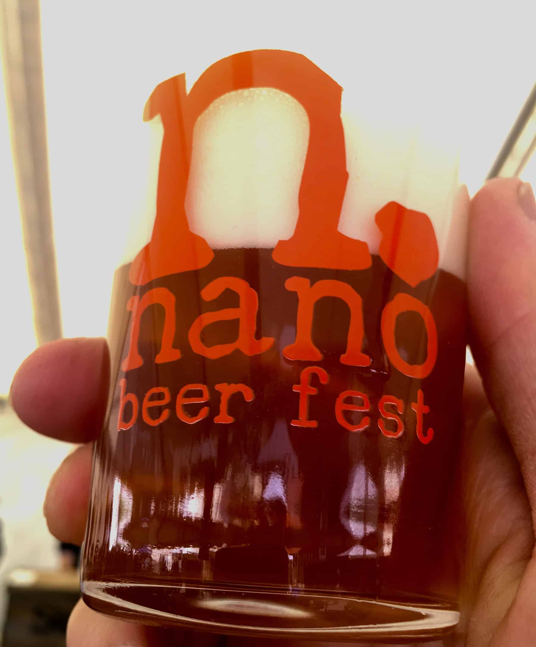
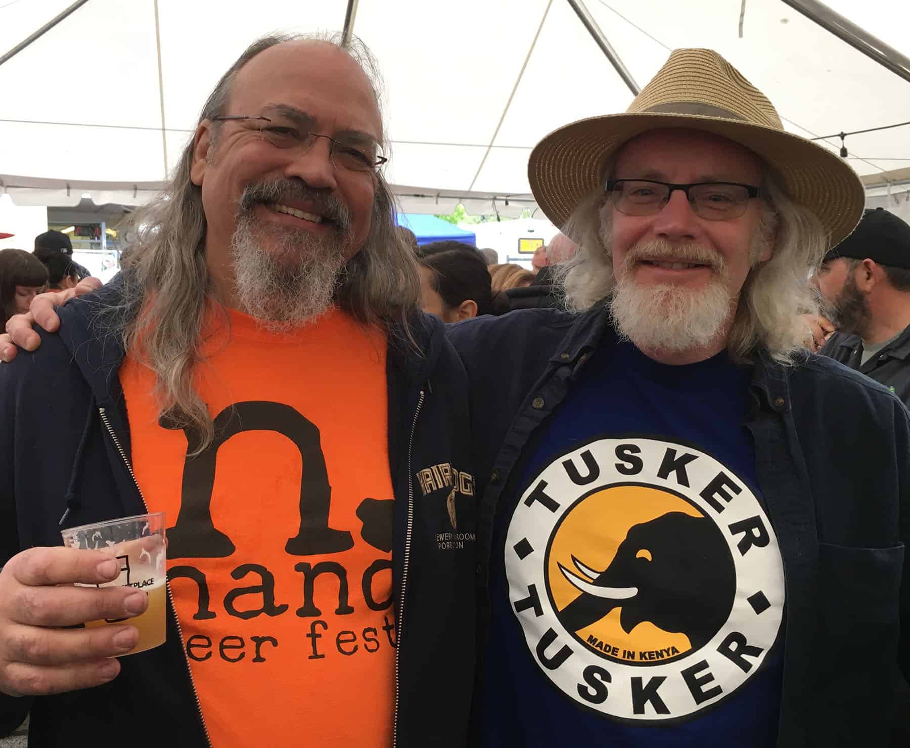
The large lowercase “n.” in this logo is in a rough-hewn typeface giving a sense of microscopic scale at enormous magnification. This is perfect for a beer festival that focuses on the very smallest commercial breweries. The last image is of the Nano founder (left) and myself (right). Cheers.
Project Details
The large lowercase “n.” in this logo is in a rough-hewn typeface giving a sense of microscopic scale at enormous magnification. This is perfect for a beer festival that focuses on the very smallest commercial breweries. The last image is of the Nano founder (left) and myself (right). Cheers.